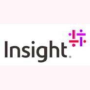
Insight Dumps Red Triangle, Unveils New Logo

Insight Enterprises has scrapped its iconic red triangle as part of a rebranding focused on the changing IT purchasing habits for businesses.
The Tempe, Ariz.-based company, No. 14 on the CRN Solution Provider 500, introduced a new logo this week consisting of four interconnected i's with an opening in the center. The i's signify the connections Insight makes with its clients, partners and teammates, according to Insight, while the opening in the logo signifies the role technology will play as businesses transform for the future.
"Where the red triangle has certainly served the company for more than a quarter century, it was time for a refresh," Steve Dodenhoff, president of Insight U.S., told CRN in an email. "Our industry and the business landscape has evolved, and our executive and marketing leadership felt there was a great opportunity for our brand to better reflect the company's growth and alignment."
[Related: Earnings Dip at Insight as Windows Server 2003 Refresh Lags]
Insight's rebranding is intended to keep up with the shift IT has made in recent years from focusing exclusively on factors like network availability and server uptime to new business-centric metrics such as growth, expanding market share, customer experience and profitability, Dodenhoff said.
This has coincided with line-of-business executives' playing a larger role in IT decision-making, thanks to an increased reliance on cloud solutions and on-demand offerings, according to Dodenhoff. Still, chief information officers and chief technology officers are continuing to drive strategic IT discussions in most businesses, and Dodenhoff said Insight is well-positioned to continue partnering with them.
The new brand is also intended to highlight the advances Insight has made in digital technologies such as cloud, where Dodenhoff said the company now manages more than 2 million users across many verticals.
To wit, Insight has also released a new company slogan, "to make meaningful connections to help businesses run smarter," as well as a new alliterative set of core values -- "hunger, heart and harmony." The effectiveness of the rebrand can best be measured by examining whether Insight grows both its business and its share of client spend within the solution provider's target markets, Dodenhoff said.
Although Insight's sales grew by 6 percent in the most recent quarter after factoring out changes in foreign currency exchange rates, profits haven't followed. The company's non-GAAP net earnings sunk 2.3 percent for the quarter, to $11.5 million.
As one of the few Microsoft licensing solution providers (LSPs), Insight has been hit hard by changes to the vendor partner compensation model surrounding cuts to cloud sales commissions and Office 365 incentive fees. Specifically, the changes reduced profits for Insight's North American software business by $11 million to $14 million in 2014 and are slated to be an additional $5 million to $10 million drag in 2015.
Dodenhoff did not directly address a question about how the rebranding will help Insight offset the reduced profits, saying instead that Microsoft is a key Insight partner and that Insight's business with Microsoft is robust.
Insight stockholders have responded favorably after the rebranding: The solution provider's stock went up 3.4 percent Monday -- the day the new brand was announced -- to $30.36 per share, marking the first time Insight's stock has traded at above $30 per share since July 7, 2014.
PUBLISHED JUNE 3, 2015