12 Things IT Will Hate About Microsoft Windows 8
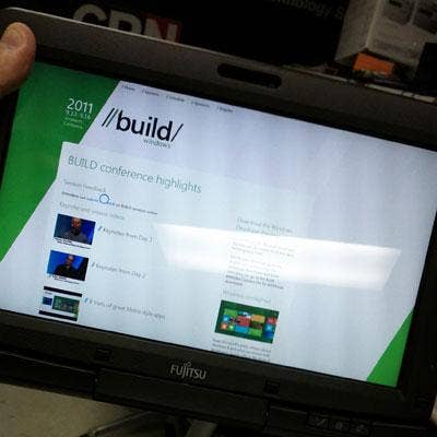
Windows 8: What A Build!
While there are some things to like about Microsoft Windows 8, such as vastly improved finger navigation (thanks to Metro) over Windows 7 when running on a tablet, there are also lots of things that IT administrators will absolutely hate. Chief among them is that same Metro, which makes the user experience cumbersome and unintuitive.
Released as a developer preview at Microsoft's Build conference last week, the next version of Windows is different in many ways than its predecessor, and not all of them good. Here are 12 things that we believe IT will hate -- or at least strongly dislike -- about Windows 8 if it were released today in its current form, including some things that have not changed at all but should have.

Piles Of Tiles
If you've seen Windows Phone 7, you're familiar with Metro, Microsoft's blocky environment for navigating features and launching apps. While Microsoft fanboys might opine on YouTube about how Windows 8 looks like it was "built by Mac," to my eyes Metro bears little resemblance to Apple's Mac OS X or Finder. A better parallel might be that the companies are building UI parity between desktop/laptop products and handhelds. This is clearly Apple's direction and it appears to be Microsoft's.
But Metro is unlike prior Windows UIs. On installation, Windows 8 funnels major apps into color blocks (tiles), piling them randomly on and off the screen to the right (shown). We know they're there because some of the app icons are cleaved mid-tile. Is that the best Microsoft UI designers could do to convey more content? There is also a scroll bar, but would it have killed them to add a handle or an arrow? Apps not lucky enough to be "blocked" come up only when using the search tool. To its credit, Metro is better than Windows 7 at navigation on tablets, but the new UI is clumsy, and will generate lots of calls to the help desk. IT won't like that.

Just Show Me The Files
Does anyone ever do anything other than view the files on a newly inserted volume? I can't recall ever suddenly wanting to "Speed up my system" after inserting a USB stick. Just open the thing and let me get to work. The smaller pop-up on the far right is displayed when selecting the "Advanced" button just below it. This button sometimes appears when right-clicking an app icon. For certain other apps, the button labeled "uninstall" appears. Huh? This confusing change will surely confound users and admins, and it adds clicks to your life with no apparent benefit.
On the flip side, I do like having the ability to remove apps without making a trip to the Control Panel, but the resulting confirmation dialog contains no "cancel" button (nor does it inform me that hitting ESC will cancel it). Metro is full of such UI "dead ends," including a whole series we found in the Settings screens, next.
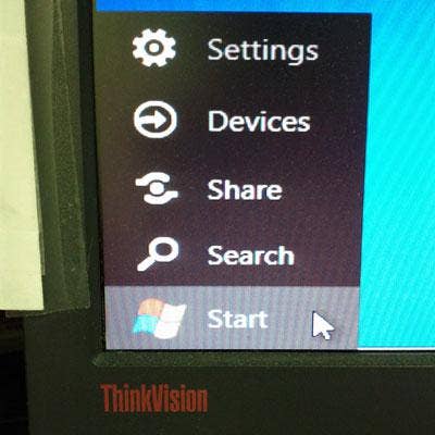
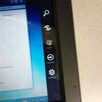
Nothing To Set, Nowhere To Go
In Windows 8, the Start menu is all but gone, and what little remains is barely functional. Chalk this up to the early release, I suppose, but it seems to me that the Settings screen consists of a few half-baked features that no one bothered to finish linking to the Control Panel.
The Start menu is displayed when the cursor gets buried in the lower-left corner of the screen. But don't expect that familiar app listing to appear when clicking Start. Instead, Metro zooms into view. Also in the Start menu are Devices and Share functions, neither of which are active in their build. When Settings is selected, a screen (like the one shown) slides in from the right side of the screen, but its functions are barely operational. Also, notice there's no "Back" or "Cancel" button here, which breaks a basic UI rule. Again, ESC does the job, but that's beside the point.
UI Ribbon More Like A Tapeworm
Many will recall the ire Microsoft stirred up when it implemented its ribbon-based UI across its Office suite a few years back. Now the dreaded UI-sore has found its way into Windows Explorer, one of the last vestiges of the old, familiar way. Like a nasty parasite, I just want to be rid of it.
Networking Still Muddled
Networking is something that changed drastically from Windows XP to Windows 7, and mostly for the good. But among the features that still needed improvement was the Network and Sharing Center, which adds layers of complexity that can have users running in circles to figure out how to do simple things.
Nothing obvious has changed from Win 7 to Win 8. For example, when first connecting to a network, Windows still prompts for a choice between "Home, Office or Public" networks. We know it does this so it can decide how to set the Windows firewall, but it doesn't bother explaining this to the user.Why not just detect the network type and do it automatically, as does the Mac OS?
Can't Quit Apps
Windows 8 introduces the concept of full-screen apps (as shown here in IE). Unfortunately, once an app is running it's not always obvious how quit it. The usual keystrokes such as ALT-F4 don't always work, and navigation controls (as seen here along the bottom) only appear when moving the mouse down or poking the bottom of the screen on a touch system. I'm still trying to figure out how to quit Piano, an app that opened on its own and keeps restarting along with the OS. This is a sour note, to be sure, and IT will hate it.
Behind (Tool)bars?
Whether you like or hate this feature depends on your point of view. The Taskbar Toolbars feature (found in Taskbar properties) was present in Windows 7 but was often overlooked perhaps because some of its functionality was linked with IE and/or duplicated elsewhere. The Toolbars are still linked to IE by default, but some of the other functions are not as easily accessible in Windows 8 as they were in Windows 7.
For example, accessing desktop apps and the Control Panel (shown) is simplified when doing so right from this menu. It's like an end-around the missing Start menu. IT departments will either like this (when the user has it enabled) or hate it when it's obscured by all the running apps clogging up the Taskbar. I'd rather just have the Start menu back, thank you.
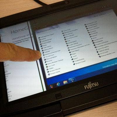
Menu Maze
If Microsoft gutted the Start menu to remove complexity, it brought it back with a Control Panel desktop menu that spawns a seemingly endless series of sub-menus. Navigating this maze is hard enough for a pro to do in person. Trying talking a novice user through this hopscotch will prompt any remote help desk worker to be looking for the Zoloft.
And if one wasn't enough, you might notice the presence of an extra Control Panel menu choice on this Desktop menu. That's not a Photoshop trick. There really are two Control Panels; the other one brings the Control Panel window familiar to Windows 7. Incidentally, the Network menu presents a list of nearby network nodes. The options presented when right-clicking on one include connecting to that node with Remote Desktop. Great for support workers, but a nightmare for the security team. Yep, I can see IT really hating this one.
Start, Then Stop
If you're like me, one of the first things you do when setting up a new Windows 7 system is to select the "Show Computer on Desktop" option in the Start menu. That's gone now, along with 99 percent of everything else we've become accustomed to seeing in the menu since '95. Adding the Computer icon to the desktop now requires a trip to the "Personalize" section of the Control Panel (a function also present in Win7), where users can select check boxes to add Computer, Network, User Files, Control Panel and the Recycle Bin to the desktop.
Tablet Drag
The Metro part of Windows 8 is better at navigation than Windows 7 alone, but some of its capabilities are not immediately obvious. For instance, moving from one app to another is done by dragging (with either a finger or the mouse) and from the left edge of the screen toward the center (the screen shot here shows the tablet in mid-drag). If you grab too high, you get nothing; too low and you bring up the Start menu. ALT-TAB still works to switch between apps using a thumbnail view, but the eye-catching 3D app-switching introduced with Vista is gone; now that key combo (Win-key+TAB) just switches from one app to the next using some sort of lame pseudo animation.
Tablet-Only Menu
After loading Windows 8 on a Fujitsu Tablet PC, we discovered this "for-tablets-only" Start menu, which appears when dragging from the right edge of the screen toward the center. Unfortunately, it presents the same semi-functional Start menu choices described earlier. Why not pop up from the bottom, as the Taskbar usually does? This change-for-no-good-reason will be one that IT hates in no time.
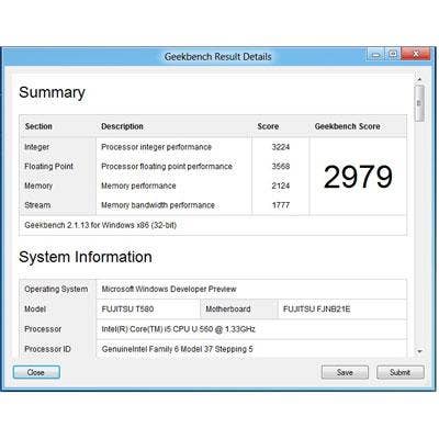
Performance Flat-Line
Finally, I present another point-of-view issue. This one serves to debunk some of the other negative coverage that's been circulating about how Windows 8 requires new hardware. In my opinion, that's simply not true. Windows 8 will not require new hardware, and here's the proof:
We wiped and installed Windows 8 (build 8102) onto a Fujitsu LifeBook T580 Tablet PC, a well-equipped three pounder built around an Intel Core i5 (model U560) 1.33 GHz processor. Prior to wiping it, it was running Windows 7 Professional 32-bit on 2GB of memory with its display set at 1366 x 768 pixels, and delivered a high Geekbench score of 3017. With Windows 8 installed, the same unit delivered a high score of 2992 (the screen shot shows a slightly lower score, also delivered by the T580). Not bad for pre-beta code that's not optimized for performance.
I expect a bigger IT issue to be Microsoft's admission that ARM-based devices won't run Windows 7 x86 apps.