20 Great-Looking Solution Provider Sites
Solution providers walk a fine line with their Websites. The sites must be professional, functional, and appealing without appearing trivial or flashy. They need to demonstrate that the solution provider has the capability to transform complex requirements into efficient solutions.
But nobody said they can't look great. In fact, demonstrating a refined sense of design can help to brand a solution provider and generate new business opportunities.
In anticipation of this year's VARBusiness 500, we took a look at the current sites of all 500 of last year's companies (many of whom you'll see again this year). In this informal survey, we recognize twenty sites that go beyond dull presentations to deliver appealing experiences for their users. They're certainly not all flawless, but each is creative, dynamic and memorable.
Joe Caponi
ascentium
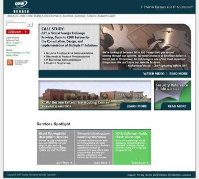
Berbee Information Networks
2007 VARBusiness 500 Rank: 102
http://www.berbee.com/
Both the lion artwork and the Hosting Center architectural drawing provide memorable imagery for Berbee Information Networks home page. An inset edge around the content blocks gives the page a sense of depth, and the green glow on the mouseovers provide a strong visual effect. Berbee scores bonus points for including an RSS feed link to their podcast and news feeds, a powerful communication tool more companies should employ.
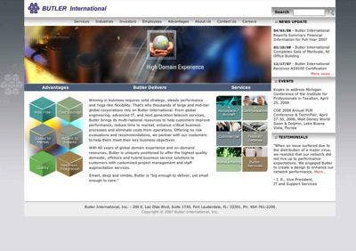
Butler International
2007 VARBusiness 500 Rank: 141
http://www.butler.com/
Butler International makes great use of shapes throughout their home page, from the colorful cubes that appear in the main section, the flash graphic, and in the grey background, to the rounded rectangles announcing the company's services, to the squares and globes that appear in the main animation block. There's also a good use of color, and the blended gradations in the navigation and heading backgrounds give the page a sense of depth.

The Computer Merchant
2007 VARBusiness 500 Rank: 211
http://www.tcml.com/
The Computer Merchant ties their logo artwork in with their home page photo imagery. In addition, they make rich use of color in their type. The company, focused on hiring and providing IT contractors, puts its latest job postings in a scrolling window on the right to provide more information in a limited space, as well as give the page a bit more interactivity.
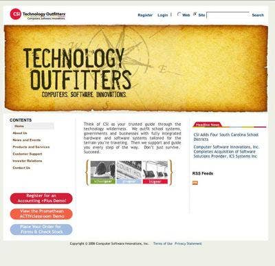
CSI Technology Outfitters
2007 VARBusiness 500 Rank: 470
http://www.csioutfitters.com/
CSI Technology Outfitters takes an old-fashioned look and uses that to express their commitment to quality worksmanship. The main Technology Outfitters image, appearing as if it were printed on an aged parchment, includes an old-fashioned compass rose in the background. At the same time, there's some subtle animation in the compass rose itself, giving the page a more dynamic feel in an almost subliminal way, while the rough edges give the page some depth. The candy colors of the bottom buttons and and the top logo provide a visual contrast (in fact, maybe too much of one!). The site includes an RSS feed link, though the feed currently only provides some basic information on the company, rather than the current news most readers would expect.
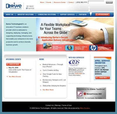
Derive Technologies
2007 VARBusiness 500 Rank: 329
http://www.derivetech.com/
Derive combines a number of appealing features on their home page: a smooth blended background, an unusual and creative logo, ample white space and dynamic navigation elements, including the central 'bump up' navigation offering their core competencies, as well as drop down navigation menus at the top that echo the "EKG" motif of the logo. The drop downs are very smooth and fun to use. Derive also employes color blends and gradations for their background and additional content blocks on the home page.
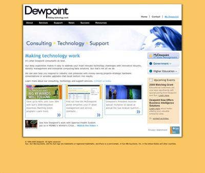
Dewpoint
2007 VARBusiness 500 Rank: 463
http://www.dewpoint.com/
There is nothing wrong with a happy home page. Deceptively simple, Dewpoint pops their main content block off a patterned yellow background with an all-around edge shadow. In the main block, unusual fonts and colors (including some colors hidden in the top navigation bar) give a lighthearted treatment to enterprise solutions consulting.
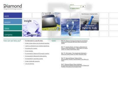
Diamond ManagementTechnology Consultants
2007 VARBusiness 500 Rank: 169
http://www.diamondconsultants.com/
Diamond manages a rare achievement on their site -- pop up navigation that integrates with the artwork it overlays. Diamond's pop-right tabs (unusual enough on their own) integrate with the underlying gridwork, rather than obscuring it. The hidden boxes -- you'll notice the clever touch that there are two in the first row, three in the second, then four and finally five -- are complimented by the four, somewhat mysterious, images to their right. The colors of each navigation bar carry through to the underlying pages. The page also employs an economy of words and abundant whitespace.
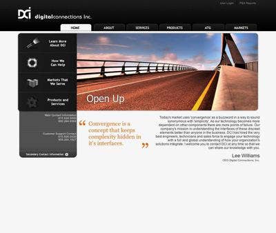
Digital Connections
2007 VARBusiness 500 Rank: 452
http://www.digitalconnections.com/
Digital Connections home page uses black and gray backgrounds to stand out from an overall white base. The left hand button bar controls the central content block, and both use simple and effective icons and photo images. The top tab bar, a dramatic black-on-black with white highlighting, provides the main site navigation.
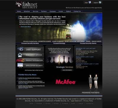
FishNet Security
2007 VARBusiness 500 Rank: 186
http://www.fishnetsecurity.com/
Black backgrounds are always risky -- do it wrong, you wind up looking like a heavy metal band rather than a technology firm. But FishNet security delivers a home page that showcases their security expertise with moody imagery that works. The black background is softened by a light texture, and though the chess pieces are a bit of a visual cliche, the rest of the interface is clean. The scroll of events on the right helpfully stops scrolling each time a full headline is displayed so they can actually be read.
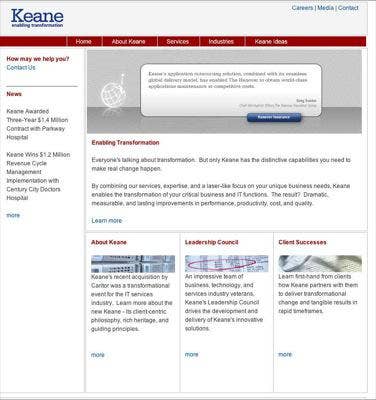
Keane
2007 VARBusiness 500 Rank: 60
http://www.keane.com/
Kean has a remarkably clean, almost minimalist home page, and serves as a stirring rebuke to every overloaded, everything-and-the-kitchen-sink home page out there. Keane uses a great deal of whitespace, and a very subdued, conservative type treatment. The headline text is the same size as the body copy -- differentiated only by the font weight and color. Client quotes get used as the main art element, reinforcing the company's professional, confident image.
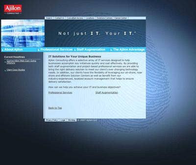
Ajilon Consulting
2007 VARBusiness 500 Rank: 90
http://www.ajilonconsulting.com/
Why are security VARs' sites so moody? Like Fishnet, Ajilon Consulting employs a dark background and adds in a dramatic background fingerprint image to visually communicate their professional specialty. Except for some navigation and news links, Ajilon uses one brief block of type to explain what they do. Can you do that?
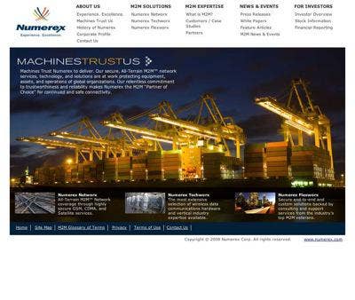
Numerex
2007 VARBusiness 500 Rank: 339
http://www.numerex.com/
Generally, big pictures don't provide much useful information for site visitors, but Numerex's home page provides four powerful images highlighting the company's areas of expertise. These images, particularly the initial cargo loading photograph, are so dramatic and memorable that they are well worth the space they take. Numerex's simple header navigation ties into their home page look and persists throughout the rest of the site. Numerex gets extra points or an appealing logo, and for for asking and answering the obvious question, "What is M2M?" right up in their top navigation.
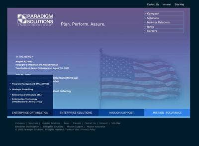
Paradigm Solutions
2007 VARBusiness 500 Rank: 232
http://www.paradigmsolutionscorp.com/
Paradigm employs a rare twist with their site navigation interface - tabs that slide up from a bar at the bottom of the main content area. (See Pepperweed Consulting for a similar effect). The animation is smooth and appealing -- you'll find yourself mousing left to right to get the four menus to race up and down the page together. The background colors change as the main site images cycle through. The secondary site navigation at the top and bottom of the page is clear and appealing. The pages' only drawback is that the latest item in the "In The News" section is eight months old...
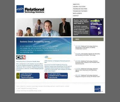
Relational Technology Solutions
2007 VARBusiness 500 Rank: 115
http://www.rts.com/
Relational Technology Solutions employs square, rectangular and oval shapes to give a simple page a good sense of space and proportion. Colors are well integrated, with subtle dynamic elements -- the mouseover effects on the top navigation and two main buttons - to keep the page from being too flat. The wave graphic appears three times, framing the page from top left to bottom right, and centering the page on the company's main message. And of course, it's never a mistake to put one of Everything Channel's most important logos on a home page!
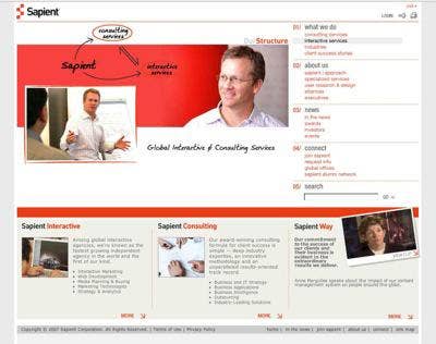
Sapient
2007 VARBusiness 500 Rank: 99
http://www.sapient.com/
Sapient picks up the bold orange color in their logo and uses it to build out their entire home page. The design features a dramatic 'fold out' right hand navigation section that adds a level of drama and dynamism to the site. The main artwork plays off the creative "white board" type of feel that the company uses to showcase their problem-solving capabilties.
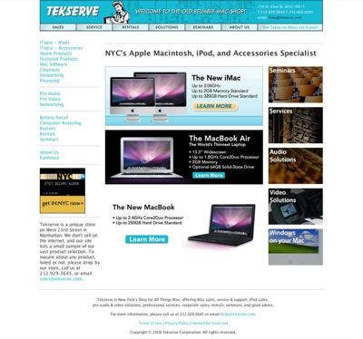
Tekserve
2007 VARBusiness 500 Rank: 283
http://www.tekserve.com/
Tekserve, a Mac specialty shop in New York, delivers an intriguing message with their quirky site, combining current Apple product imagery with old-fashioned artwork that recalls the "Rosie the Riveter" imagery from the Second World War. Rosie gets set on top of 70's era-circuit diagrams in the header background. Their friendly greeting "Welcome to the old reliable Mac shop" ties together their message of leading edge products and old fashioned customer service. The navigation, softened with color blends, is clean and easy to use, and the Tekserve logo employs an unusual typeface to reinforce the overall effect.
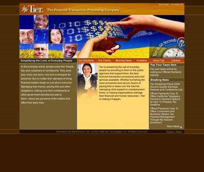
Tier
2007 VARBusiness 500 Rank: 166
http://www.tier.com/
Tier makes good use of colors, shapes and images to deliver a memorable home page. The background combines patterns and colors and the primary links and artwork tie in to the company's theme of blending bits and bytes with dollars. The site's main navigation runs across the center of the page, separating the company's image identity from more conventional text, at just the spot where a reader would let their eyes come to rest.
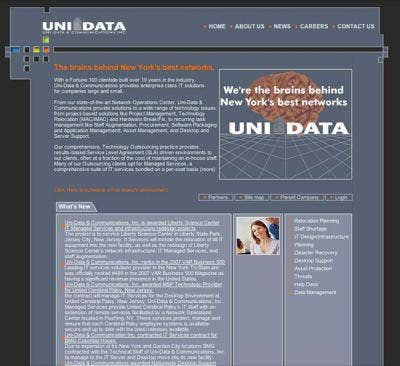
Uni-DataCommunications
2007 VARBusiness 500 Rank: 489
http://www.unidatait.com/
Though Uni-Data would benefit from cutting down the run-on text on its home page, it's on this list for it's clever and unique dynamic logo. The boxes in the top left art element change colors, seemingly randomly, in a steady progression. It's reminiscent of the blinking lights on a classic mainframe computer system, or even those you'd see on the original Star Trek Enterprise's control panels. It's futuristic in an old-fashioned way. The other dynamic element, the animation on the right side of the page, is simple and appealing, and delivers a straightforward message on the company's core competencies.
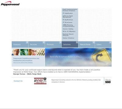
Pepperweed Consulting
2007 VARBusiness 500 Rank: 473
http://www.pepperweed.com
Pepperweed is one of the smallest VARBusiness 500 companies, but their home page takes the biggest risks of all the sites we're spotlighting here. It's a love it or hate it affair.
Most of the home page space is given over to... well, nothing... just a grid of pale spots. The navigation slides up, smoothly, from the row of large blue buttons underneath, with the little arrows flipping to point at their content while they're active. Even more dramatically, the site auto-plays a background sound of... almost nothing again, just blowing wind, spooky and disconcerting, which eventually builds up into a startling whoosh as the final images of the site's animation gets displayed. Can a Web page be cinematic? This one is.