Big Data Buzzwords From A to Z

Big Data Buzzwords
Big data is one of the, well, biggest trends in IT today, and it has spawned a whole new generation of technology to handle it. And, with new technologies come new buzzwords: acronyms, technical terms, product names, etc.
Even the phrase "big data" itself can be confusing. Many think of "lots of data" when they hear it, but big data is much more than just data volume.
Here, in alphabetical order, are some of the buzzwords we think you need to be familiar with.

ACID
An acronym for Atomicity, Consistency, Isolation and Durability, ACID is a set of requirements or properties that, when adhered to, ensure the data integrity of database transactions during processing. While ACID has been around for a while, the explosion in transaction data volumes has focused more attention on the need for meeting ACID provisions when working with big data.
Big Data
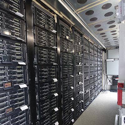
IT systems today pump out data that's "big" on volume, velocity and variety.
Volume: IDC estimates that the volume of world information will reach 2.7 zettabytes this year (that's 2.7 billion terabytes) and that's doubling every two years.
Velocity: It's not just the amount of data that's causing headaches for IT managers, but the increasingly rapid speed at which data is flowing from financial systems, retail systems, websites, sensors, RFID chips and social networks like Facebook, Twitter, etc.
Variety: Going back five, maybe 10 years, IT mostly dealt with alphanumeric data that was easy to store in neat rows and columns in relational databases. No longer. Today, unstructured data, such as Tweets and Facebook posts, documents, Web content and so on, is all part of the big data mix.
Columnar (or Column-Oriented) Database
Some new-generation databases (such as the open-source Cassandra and HP's Vertica) are designed to store data by column rather than by row as traditional SQL databases do. Their design provides faster disk access, improving their performance when handling big data. Columnar databases are especially popular for data-intensive business analytics applications.

Data Warehousing
The concept of data warehousing, copying data from multiple operational IT systems into a secondary, off-line database for business analytics applications, has been around for about 25 years.
But as data volumes explode, data warehouse systems are rapidly changing. They need to store more data -- and more kinds of data -- making their management a challenge. And where 10 or 20 years ago data might have been copied into a data warehouse system on a weekly or monthly basis, data warehouses today are refreshed far more frequently with some even updated in real time.
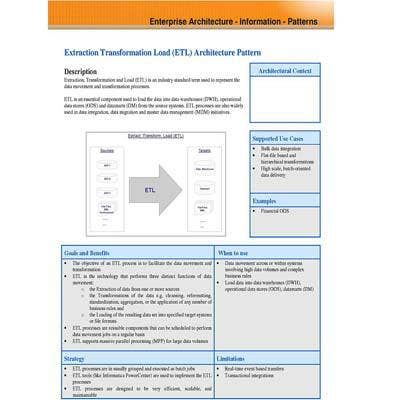
ETL
Extract, transform and load (ETL) software is used when moving data from one database, such as one supporting a banking application transaction processing system, to another, such as a data warehouse system used for business analytics. Data often needs to be reformatted and cleaned up when being transferred from one database to another.
The performance demands on ETL tools have increased as data volumes have grown exponentially and data processing speeds have accelerated.

Flume
Flume, a technology in the Apache Hadoop family (others include HBase, Hive, Oozie, Pig and Whirr), is a framework for populating Hadoop with data. The technology uses agents scattered across application servers, Web servers, mobile devices and other systems to collect data and transfer it to a Hadoop system.
A business, for example, could use Apache Flume running on a Web server to collect data from Twitter posts for analysis.

Geospatial Analysis
One trend fueling big data is the increasing volume of geospatial data being generated and collected by IT systems today. A picture may be worth 1,000 words, so it's no surprise the growing number of maps, charts, photographs and other geographic-based content is a major driver of today's big data explosion.
Geospatial analysis is a specific form of data visualization (see "V" for visualization) that overlays data on geographical maps to help users better understand the results of big data analysis.

Hadoop
Hadoop is an open-source platform for developing distributed, data-intensive applications. It's controlled by the Apache Software Foundation.
Hadoop was created by Yahoo developer Doug Cutting, who based it on Google Labs' MapReduce concept and named it after his infant son's toy elephant.
Bonus "H" entries, or HBase, is a non-relational database developed as part of the Hadoop project. The Hadoop Distributed Filesystem (HDFS) is a key component of Hadoop. And, Hive is a data warehouse system built on Hadoop.
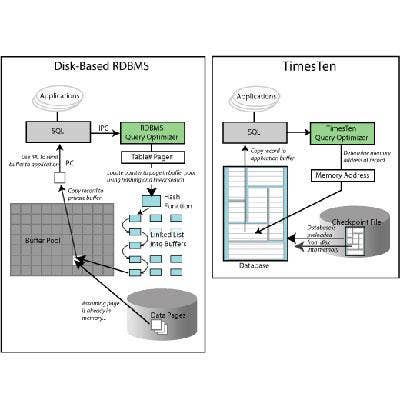
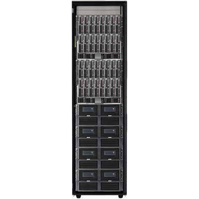
In-Memory Database
Computers generally retrieve data from disk drives as they process transactions or perform queries. But, that can be too slow when IT systems are working with big data.
In-memory database systems utilize a computer's main memory to store frequently used data, greatly reducing processing times. In-memory database products include SAP HANA and the Oracle Times Ten In-Memory Database.
Java
Java is a programming language developed at Sun Microsystems and released in 1995. Hadoop and a number of other big data technologies were built using Java, and it remains a dominant development technology in the big data world.
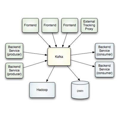
Kafka
Kafka is a high-throughput, distributed messaging system originally developed at LinkedIn to manage the service's activity stream (data about a Website's usage) and operational data processing pipeline (about the performance of server components).
Kafka is effective for processing large volumes of streaming data -- a key issue in many big data computing environments. Storm, developed by Twitter, is another stream-processing technology that's catching on.
The Apache Software Foundation has taken Kafka on as an open-source project. No jokes about buggy software, please ...