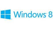
Microsoft Unveils Logo For Windows 8

Microsoft isn't only "re-imagining" its Windows software, it's re-imagining the Windows logo.
Friday Microsoft unveiled the logo for Windows 8, the next generation of the company's flagship operating system that's expected to be generally available later this year. Microsoft has said it will debut a consumer preview version of the software on February 29 during the Mobile World Congress 2012 in Barcelona.
Unlike the multi-color, flag-like graphic that has been a component of every Windows logo going back to Windows 3.1, the new logo is entirely one color (shown in light blue) with a simple four-pane window viewed at a slight angle.
"The Windows logo is a strong and widely recognized mark, but when we stepped back and analyzed it, we realized an evolution of our logo would better reflect our Metro-style design principles and we also felt there was an opportunity to reconnect with some of the powerful characteristics of previous incarnations," said Sam Moreau, principal director of user experience for Windows, in a blog post.
Moreau describes how early in the Windows 8 development process managers met with designers from the Pentagram design consulting firm to come up with the new logo. At one point designers asked why Windows was shown as a flag.
In the blog Moreau notes that logos for early editions of Windows did not use the wavy flag-like icon and the new logo is somewhat reminiscent of the graphic used for Windows 1.0.
"Microsoft and Windows are all about putting technology in people's hands to empower them to find their own perspectives," Moreau said. "And that is what the new logo was meant to be. We did less of a re-design and more to return it to its original meaning and bringing Windows back to its roots -- re-imagining the Windows logo as just that -- a window.
"With Windows 8, we approached the logo redesign with a few key goals on mind. We wanted the new logo to be both modern and classic by echoing the International Typographic Style (or Swiss design) that has been a great influence on our Metro style design philosophy," he said. "Using bold flat colors and clean lines and shapes, the new logo has the characteristics of way-finding design systems seen in airports and subways," Moreau said.
"It was important that the new logo carries our Metro principle of being 'Authentically Digital.' By that, we mean it does not try to emulate faux-industrial design characteristics such as materiality (glass, wood, plastic, etc.). It has motion -- aligning with the fast and fluid style you'll find throughout Windows 8.
"Our final goal was for the new logo to be humble, yet confident. Welcoming you in with a slight tilt in perspective and when you change your color, the logo changes to reflect you. It is a 'Personal' Computer after all," Moreau said.
Reaction to the new logo has been decidedly mixed, judging by the comments to Moreau's blog.
"Wow. Big change, but I think it accurately reflects how Microsoft is attempting to modernize their brands. I like the new design, and I think it'll look great on Windows 8, but the classic 90s logo is still my favorite. I'm hoping we'll see it debut on the 29th," said Joel Braun, in a comment.
But not everyone agrees. "I'm a fan of Windows. I'm a HUGE fan of Windows 8. But this, guys, is epic failure. Why not just make it like the start button in the [Windows 8 developer preview], maybe in one color, but this... this is disappointing," said Matej.
And while a commenter named "xpclient" liked the design, he/she pronounced the monochromatic color ugly. "My Windows life is now colorless and monotonous."