10 Worst Web Sites To View On A Mobile Browser

With more and more people relying on their mobile devices as their primary communications tool, whether they are smart phones or feature phones, the mobile Web is becoming increasingly important. But a host of companies are failing to make their Web sites mobile friendly, making them a hassle to navigate and difficult to read. Their sites are slow to load, use tables that won't fit on the screen and are overloaded with giant advertisements that break up the flow.
ChannelWeb recently spoke to Vance Hedderel, director of public relations and communications for dotMobi, a mobile Web consortium behind the .mobi domain to ensure sites will work on most mobile browsers while also offering tools to develop and build .mobi-based mobile Web sites. The consortium comprises many industry heavy hitters like Google, Microsoft, Samsung, T-Mobile, Nokia and more working together to make the mobile Web more useful.
"People need to build content appropriate for mobile devices and rethink it as more than a small-screen device," Hedderel said. "The whole idea is to make the mobile Web happen."
Hedderel highlighted 10 popular sites that could use a kick in the mobile pants. The following are what Hedderel and dotMobi have defined as the 10 worst Web sites to view on a mobile browser.
While Oxfam International works diligently to help the impoverished through its confederation of 13 organizations, its Web site is in need of a mobile makeover, Hedderel said.
According to Hedderel, the chartable organization's site is slow to load and flooded with graphics that don't render well on a mobile device. And along with being hard to read, the mobile site balks by making it take several steps for visitors to help the cause and make a donation, requiring waiting for several pages to load and only sometimes allowing a donation to go through, a serious slip considering the bulk of Oxfam's work comes from donations.
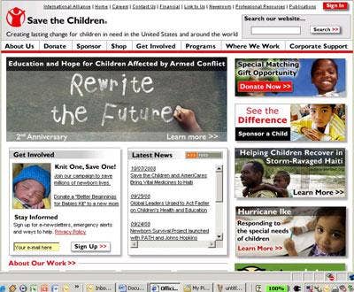
Another charitable organization whose Web presence could benefit from a mobile facelift is Save The Children. While its message is evident, its shoddy mobile capabilities make it difficult to navigate through a host of graphics and tabs and, like Oxfam's, it's difficult to find a way to make a donation when viewed on a mobile browser.

A photo-sharing service should have a top-notch mobile Web site, especially with the increasing number of devices featuring a digital camera as a strong selling point. Photobucket, however, "is not thinking of mobile users," Hedderel said, noting that the site is "sloppy" when viewed on a mobile device. Hedderel said Photobucket takes forever to load on a mobile browser and the layout is difficult to navigate, a mobile experience he said is "painful" and lacks the robust options and appearance of its non-mobile counterpart.
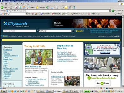
The URL would imply that Mobile.Citysearch.com is ideal for surfing on a mobile browser to find out what's going on in any town at any time. Mobile users expect to have information on happenings, restaurants and shows at their fingertips, but Citysearch, despite having a "mobile friendly" site, falls short. On a mobile screen, the site reveals link after link after link after link, making it incredibly difficult for out-of-towners to find information quickly and easily, usually resulting in them having to come up with their own ideas for something to do on a Saturday night.
Editor's note: A mobile Citysearch conducted by ChannelWeb indicated that our current location was Potwin, Kansas, despite being in Framingham, Mass. and having never been to Potwin, though we're sure there's a lot to do.
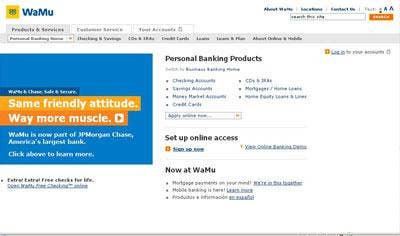
With the economy on the brink and its own future to worry about, it doesn't help Washington Mutual to have a disastrous Web site when it comes to mobile browsing. Hedderel said many financial institutions have embraced the mobile Web, making it easy for customers to find branches and ATMs and check their balances from a mobile device. That's not the case with WaMu, which is difficult to navigate and essentially recreates its .com site just for a smaller screen, presenting lists and lists of links and menus.

A comfy sweater or a flannel lined pair of jeans may keep you warm in the winter, but the Web site for LL Bean, the major clothing retailer, will leave you cold if you try to view and order an item on the go. Quite the faux pas for a site that targets fashion forward outdoorsy types. LL Bean's mobile Web presence doesn't offer a rich experience for folks on the go. Hedderel said it renders just fine on most devices, but the overabundance of blanketed links that create long lists of full text URLs make it difficult to find exactly what you're looking for, even if you take the time to scroll through pages and pages of text.
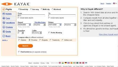
Travel sites have also been quick to jump on the mobile Web revolution, Hedderel said. Priceline does it right with its Web site and how it works on the small screen. Kayak, however, misses the mark. And with mobile users often trying to access travel info while on the road, that's a major strike against Kayak. The site, when viewed mobile, takes an incredibly long time to load and render. Once onboard, users must select their country before continuing, and even then scrolling through the menu is slow going.

Reddit.com has become known as a solid news aggregator, letting users select which topics they want to see headlines from and linking to the world's top stories. Its mobile Web presence promises the same intuitiveness, but there's a twist. While Reddit's mobile home page appears crystal clear and has been optimized for mobile browsing, the articles it links to are still designed to be viewed on a PC, creating an unattractive mobile view. That fundamental problem, Hedderel said, offers a "horrible mobile experience."

Bam! Emeril Lagasse, the famous chef, needs to kick his Web site up a notch to ensure smooth mobile surfing. Emerils.com, which features a store, news, recipes, a restaurant locator, video and other content for food lovers just doesn't translate to the mobile Web, Hedderel said. The rich experience the site offers on a PC just doesn't come through, not enabling mobile users to view recipes, buy products or find and make reservations at restaurants. Additionally, it displays poorly and shows bundles of long links.

Wayne Gretsky would be peeved. Users that want to look up his stats, or that of other NHL greats, will have a tough time doing it on a mobile browser. With an extra long loading time and several clicks required to navigate to information and statistics, Hedderel said it would actually be faster for users looking for information to put down their device, go home and look it up on their PC.