20 Great-Looking Solution Provider Sites For 2010
Navigating The Solution Provider Web
Solution provider web sites have come a long way since we last looked at them. They're faster and more dynamic, displaying more information in friendly, professional fashion.
But still, too many sites are playing it safe -- generic graphics, monochromatic color schemes (nearly always blue), dull navigation. Those sites are not impressive; not memorable, and not going to cut it in 2011.
But some solution providers get it right. The twenty websites highlighted here were selected from our 2010 VAR500 and Fast Growth 100 solution provider lists. You may question some of the design choices these companies made, but they're clearly unafraid to stand out, to stake a claim for their customers' business, and to declare exactly who they are. With dramatic images, vibrant color and distinctive design, they provide a lesson to anyone looking to engage customers and communicate their unique offerings online.
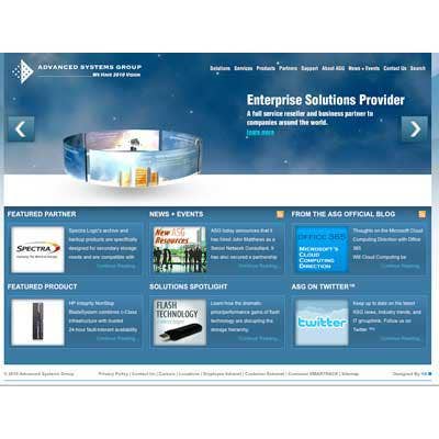
Advanced Systems Group
2010 VAR 500 Rank: 222
http://www.virtual.com
Advanced Systems Group puts a spin into the typical image carousel by integrating it into the page background. With outer space as the background image, the site certainly isn't lacking for visual depth, which is also highlighted by the inset shadows around the graphics on the page's bottom half. And it never hurts to grab a domain name like virtual.com!
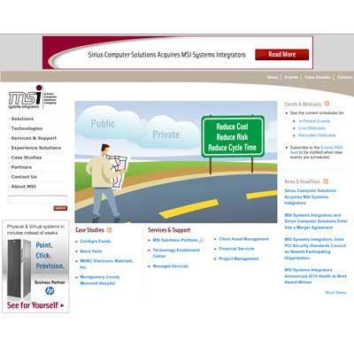
MSI Systems Integrators
2010 VAR 500 Rank: 133
http://www.msiinet.com
Cartoons are fun. MSI, now part of Sirius Computer Solutions, uses an appealing animation to bring the reader's attention directly to the company's primary message: "Start your cloud journey today with MSI." Additional points for making the company's RSS feeds so easy to access.
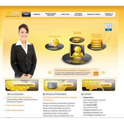
General DataTech
2010 VAR 500 Rank: 235
http://www.gdt.com
Sure, the attractive woman on the home page is a bit cliche (does she even work there?), but General DataTech scores points for their turntable carousel spelling out their capabilities, as well as their bold color scheme (go orange!) and sense of page depth achieved with multiple layers of background, including the cut-in effect on the three map images on the lower half of the page.
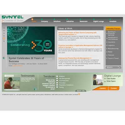
Syntel
2010 VAR 500 Rank: 117
http://www.syntelinc.com
Syntel stands out with a unique look that starts with a green and orange color scheme, using soft color from darkest at the top and left, to lighter at the bottom and right sides of page elements. The top navigation bar is spiced up with a dynamic orange circle that races to each item as it's highlighted, an effect that's repeated in the main image controller on the left-hand edge of the page.
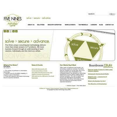
Five Nines Technology Group
Fast Growth 2010 Rank: 13
http://www.gonines.com
Central image carousels aren't unusual, but Five Nines' carousel rolls up horizontally -- a distinctive approach. Their site is understated, with soft colors and rounded corners. Plenty of white space is used. The lower-case treatment of the "solve > secure > advance" tag line and the programmery use of ">" continue the casual look, while the one handwritten "Ideas" at bottom right grabs attention.
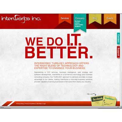
Interworks
Fast Growth 2010 Rank: 45
http://www.interworks.com
Interworks dramatically challenges your expectations of a home page. The message: "We Do I.T. Better" is the page, followed by a brief company description. Unusual pull-down ribbon menus, ticket-style tabs for social networking links, and right side help tabs are scattered around the edges.
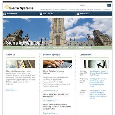
Sierra Systems
2010 VAR 500 Rank: 261
http://www.sierrasystems.com
At first glance, Sierra has one of the more typical solution provider home pages -- a top logo, navy blue colors, and a balanced three column layout. What makes this site shine, though, is the complex and visually impressive transition effects between the images in the center of the page. Nearly hypnotic, it really has to be seen.
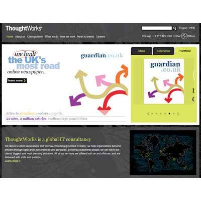
ThoughtWorks
2010 VAR 500 Rank: 226
http://www.thoughtworks.com/
The interface to ThoughtWorks home page takes a minute to 'get' -- the green tabs and dots on the right control the display of the larger image to the left. The usability could be clearer, but it works to display a rich variety of client work all in one spot. The hand-drawn office locations map in the lower-right looks pretty enough, but is almost too dark to make out. Despite these drawbacks, ThoughtWorks bright imagery make it a stand out.
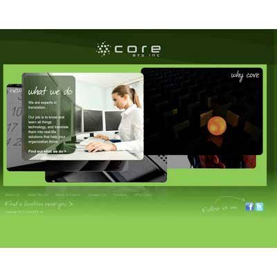
Core BTS
2010 VAR 500 Rank: 269
http://www.corebts.com
This one-of-a-kind page features five information panels at its heart that might be tabs on a typical site. Shown here, they are semi-overlapping images revealed by a simple mouseover, and give the home page an almost game-like feel. Otherwise the page is wonderfully minimal, with a black to green blended background, and a use of a handwritten font face to give a casual feel to the page.
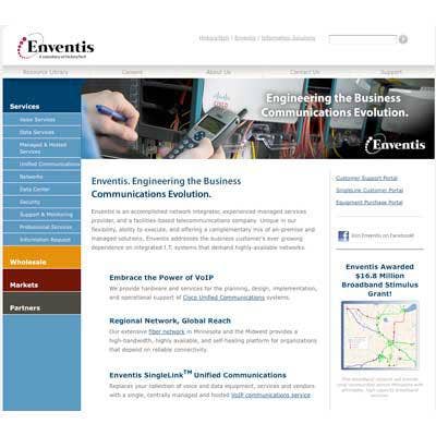
Enventis
2010 VAR 500 Rank: 313
http://www.enventis.com/
The most impressive part of Enventis' home page is the central animation that illustrates each of the company's capabilities in turn and winds up on a photo that incorporates the company tagline "Engineering the Business Communications Evolution." But that's all that's needed. The rest of the home page's simple layout, with a modest use of color in the navigation and a good amount of white space, gets carried throughout the rest of the site.
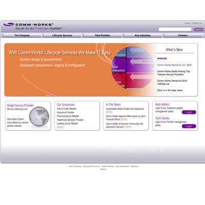
Comm-Works
2010 VAR 500 Rank: 350
http://www.comm-works.com
Comm-Works animation also illustrates each of the company's capabilities, and uses differing color schemes and images to engage the reader. The top tabs are simple but efficient, the bottom bubbles puff out gently on mouse-over, and the use of purple in the logo and headlines stands out.
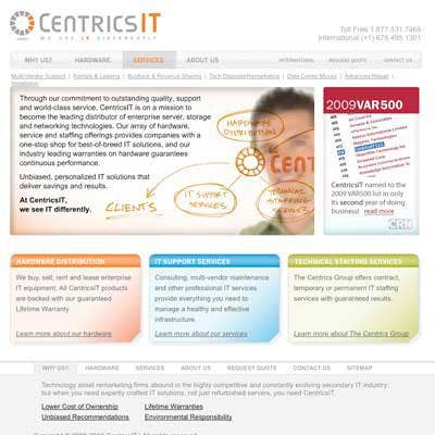
Centrics IT
2010 VAR 500 Rank: 374
http://www.centricsit.com/
Use care if playing audio on a home page -- unexpected sounds can confuse the reader and be inappropriate in some work settings. Centrics IT's sound, really a squeak, plays very briefly, though, and is used to accent the animation of the man drawing on the screen. A strong tagline: "We see IT Differently," encourages the reader to find out how. Use of color here is very rich, with blues, reds, oranges and greens all at work. The whole page is given depth with a shadowed background.
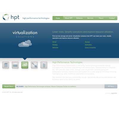
High Performance Technologies
Fast Growth 2010 # 74
http://www.highperftech.com
HPT's green and blue, minimalistic home page takes advantage of the full width of today's wide browser windows, a small improvement over centered home pages, and a big one over home pages stuck up in the top left corner of browser windows. It's core capabilities are displayed via five icons that trigger the main display area above them when they're moused-over.
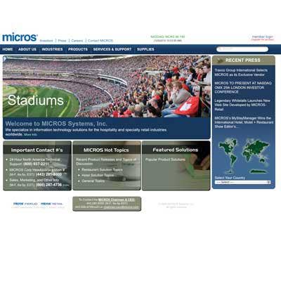
Micros Systems
2010 VAR 500 Rank: 72
http://www.micros.com
Like many sites, Micros' home page is dominated by a rotating series of appealing photo images. But rather than illustrating their core competencies, Micros puts a twist on the typical and highlights their primary customers instead. It's a clever way to make their audience feel a part of the site. There's a clear tagline: "We specialize in information technology solutions for the hospitality and specialty retail industries," and good use of color.
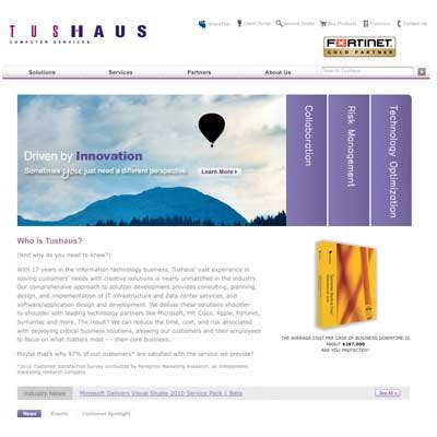
Tushaus
2010 VAR 500 Rank: 459
http://www.tushaus.com
Tushaus features a clean, direct design and the best use of purple of any of these sites. What's unusual about Tushaus is their take on the big capabilities graphic -- mousing over the tabs opens new images by scaling them to the left and right -- accordion style. The 'Industry News' headline display is executed as a fade-in and out -- an unusual twist.
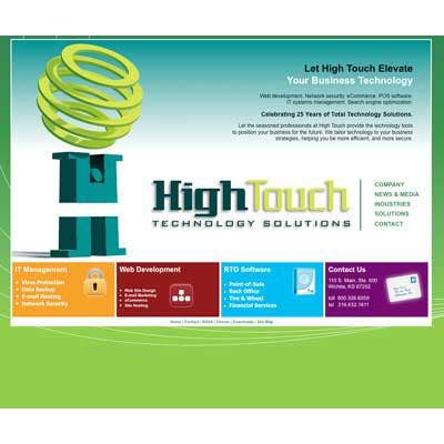
High Touch Technology Solutions
2010 VAR 500 Rank: 465
http://www.hightouchinc.com
HighTouch feels like the happiest of all these home pages. A cartoonish, split "H" figure, holding a globe-shaped set of rings aloft, anchor the page. Bold crayon colors are used and the green site background and swirls give the page depth. The navigation icons are simple and appealing.
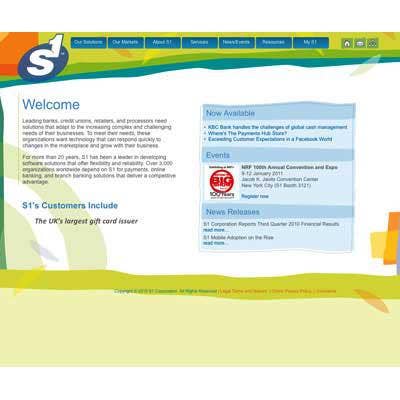
S1
2010 VAR 500 Rank: 166
http://www.s1.com
S1 takes the hand-made site look to it's logical conclusion -- their home page looks like a painting, with a few straight lines and much mixing and matching of a full palette of colors. The border on the news box is carefully offset from the background colors, giving depth and emphasis. The conventional tabs at the top are the giveaways that you're on a web site, but they work cleanly and effectively.
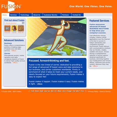
FusionTel
2010 VAR 500 Rank: 393
http://www.fusiontel.com
Fusion features a bold orange background, with a white logo and tagline. The heart of the home page displays a animation that illustrates "forward thinking" with a backwards-running character. The old fashioned look of the images and navigation icons is carried out through the rest of the site. Intriguingly, the bottom of the site features a crawl of the word "Yes" in many languages. Subliminal? You'll find the tagline "Expect Yes" on their Customer Service page.
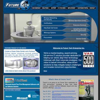
Future Tech
2010 VAR 500 Rank: 352
http://ftei.com/
Get ready. Future Tech's home page features a talking robot receptionist that welcomes the reader and guides them through the company's core competencies. But it's not a play-once animation -- the robot remains active as you click any of the primary tabs, throwing away windows and drawing up new ones. A second animation rotates through the company's partner logos. Love him or hate him, the robot, once seen (and heard), is not soon forgotten.
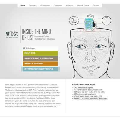
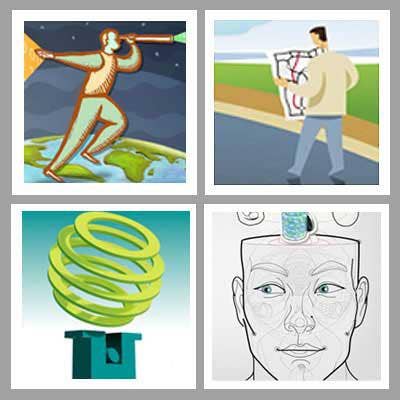
OST
2010 VAR 500 Rank: 425
http://www.ostusa.com
Unique doesn't begin to describe the OST USA home page. It's dominated by a line drawing of a face with a spinning clockwork diagram behind it and four line drawings rotating above it (where his skull should be). As the tag says, you're "Inside The Mind Of OST." The drawings represent OST's primary specialties and are linked to four buttons on the left side of the page. The use of color is limited, except in spots like the blue eyes. The blue eyes that blink and follow your cursor as you mouse around on the page.